
Visualizing Large Data Sets
Stephen G. Eick*
Bell Laboratories (A Division of Lucent Technologies)
Abstract
Visualization is a key technology for understanding large datasets. It is useful throughout the analysis process, for exploratory descriptive analysis, to aid in model building; and for presenting the analysis results. Our approach to visualizing abstract, non-geometric data involves domain-specific representations, multiple linked views, color, and a highly-interactive user interface using filtering and focusing to reduce visual clutter. We have developed a software infrastructure embodying our design principles for producing novel, high-quality visualizations of corporate datasets.
1 Introduction
Just as spreadsheets revolutionized our ability to understand small amounts of data, visualization will revolutionize the way we understand large datasets. Our research focuses on extracting the information latent in large databases using visual techniques. The difficulty in extracting this information lies in understanding the complexity of the databases. To aid in this task, we have created many novel, highly interactive visualizations of large datasets. This involved developing the techniques, software tools, and infrastructure to mine knowledge from corporate databases so that it can be put to competitive and commercial advantage.
|
* |
AT&T Bell Laboratories-Rm 1G-351, 1000 East Warrenville Road, Naperville, IL 60566, email: eick@research.att.com |
2 Domain-Specific Representation
A key component of an effective visualization involves the visual representation of the data. The representation determines how the items in the dataset are rendered on the computer display. The best representations are often domain-specific: scatterplots for statistical data, maps for spatial data, and node and link diagrams for network data, for example. Inventing a representation for a new domain is a difficult, creative, and iterative process.1 The representation should take full advantage of perceptual cues such as size. positions. color, depth, and may even use motion and sound.
3 High Information Density
Our representations are often compact, color-coded glyphs positioned spatially. By using compact glyphs that overplot gracefully we can pack a lot of information into an image and thereby display a large dataset. A high-resolution 1280×1024 workstation monitor has over 1,300,000 pixels. Our goal is to use every pixel to display data, thereby maximizing the information content. in the image.
In some cases is is possible to display an entire dataset on a single screen, thereby eliminating the difficult navigation problems associated with panning and zooming interfaces that focus on small portions of the database.
4 Interactive Filters
Often information-dense displays become overly cluttered with too much detail. One approach to solving the display clutter problem involves interactive filters that reduce the amount of information shown on the display. Humans have sophisticated pattern recognition capabilities, perhaps due to our evolution, and are very efficient at manipulating interactive controls to reduce visual clutter. We exploit this to effortlessly solve the complex computational problems involved with determining when a display is too busy for an easy interpretation. Our approach is to leverage people's natural abilities by designing user interface controls that parameterize the display complexity.
5 Multiple Linked Views
The power of our representations is magnified through the use of interaction and linked views. Each view, whether custom or standard (color keys, bar charts, box plots, histograms, scatter plots, etc.), functions both as a display and a control panel. Selecting and filtering data in one view instantly propagates to the other views, thereby providing additional insights. Linking multiple views interactively provides an integrated visualization far more powerful than the sum of the individual views.
6 Systems
Our systems have been used to successfully analyze and present software version control information. file system sizes. budgets, network traffic patterns, consumer shopping patterns, relational database integrity constraints, resource usage on a compute server, etc. The amount of information that our systems present on a single screen is between 10,000 and 1,000,000 records. Some of the more interesting systems we have built include:
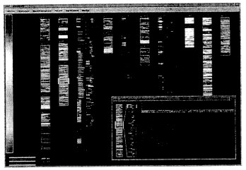
- SeeSoftTM-lines of text in files [Eic94] (Figure 1)
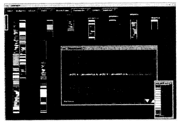
- SeeSlice-program slices and code coverage [BE94] (Figure 2)
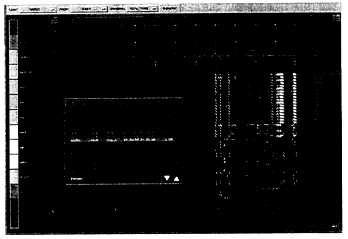
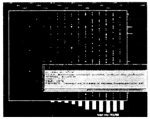
- SeeLog-time-stamped log reports [EL95] (Figure 3)
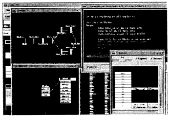
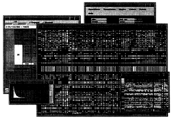
- SeeData-relational data [AEP95] (Figure 4)
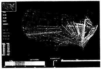
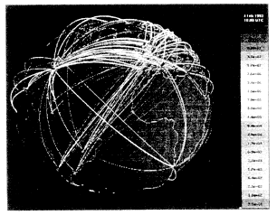
- SeeNet-geographic networks data [BEW95] (Figures 5 and 6)
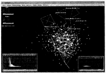
- NicheWorksTM-abstract networks [EW93] (Figure 7)
- SeeDiffTM-file system differences
- SeeLib-bibliographic databases [EJW94] (Figure 9)
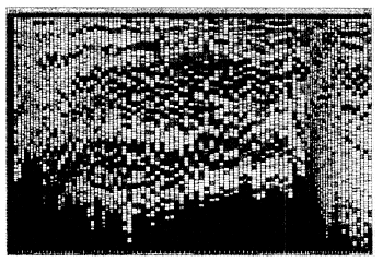
- SeeSys-hierarchical software modules [BE95] (Figure 10)
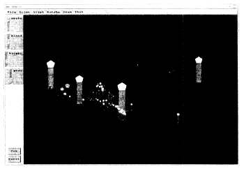
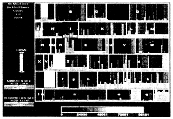
- SeeSalesTM-retail sales inventory and forecasts (Figure 11)
- SeeTree-hierarchical data
- SeeFraud-network calling fraud.
-
Since the needs of each user are unique, the best visualizations are task-oriented. The most successful visualizations help frame interesting questions as well as answer them. Our visualizations:
- Make use of existing data. In many cases large databases of vital importance to an organization already exist. Our visualizations extract meaningful information from this data.
- Are directed toward real problems with targeted users. Our efforts are motivated by business needs and address real problems.
- Focus on understanding and insight. Results are more important than any particular technique.
- Are used throughout the analysis process including the initial data exploration, intermediate model formulation, and final result presentation.
7 Software and Technology
Underlying all of our visualizations is a common infrastructure embodied in a C++ library that handles interaction, graphics, and view linking. This C++ Visualization Library helps us to:
- Minimize our development time,
- Encapsulate expertise and design principles,
- Build cross-platform systems (UNIX/X11, Open GL, and PC/Windows), and
- Keep visualization application code small.
8 Conclusion
Visualization is a key technology that can help users understand the complexity in industrial-sized systems. We have exploited this technology to investigate a variety of large and complex data sets. Interactive data visualization is complementary to other analytic, model-based approaches and will become a widely used tool for extracting the information contained in large complex datasets.
Acknowledgments
The research presented here represents the joint efforts of Jackie Antis. Dave Atkins, Tom Ball, Brian Johnson, Ken Cox, Nate Dean, Paul Lucas, John Pyrce, and Graham Wills.
References
[AEP95] Jacqueline M. Antis, Stephen G. Eick, and John D. Pyrce. Visualizing the structure of relational databases. IEEE Software, Accepted for publication 1995.
[BE94] Thomas Ball and Stephen G. Eick. Visualizing program slices. In 1994 IEEE Symposium on Visual Languages, pages 288-295, St. Louis, Missouri, 4 October 1994.
[BE95] Marla J. Baker and Stephen G. Eick. Space-filling software displays. Journal of Visual Languages and Computing, 6(2), June 1995.
[BEW95] Richard A. Becker, Stephen G. Eick, and Allan R. Wilks. Visualizing network data. IEEE Transactions on Visualization and Graphics, 1(1):16-28, March 1995.
[Eic94] Stephen G. Eick. Graphically displaying text. Journal of Computational and Graphical Statistics, 3(2):127-142. June 1994.
[EJW94] Stephen G. Eick, Eric E. Sumner Jr., and Graham J. Wills. Visualizing bibliographic databases. In John P. Lee and Georges G. Grinstein, editors. Database Issues for Data Visualization, pages 186-193. Springer-Verlag, October 1994. Lecture Notes in Computer Science.
[EL95] Stephen G. Eick and Paul J. Lucas. Displaying trace files. Software Practice and Experienced, Accepted for publication 1995.
[EW93] Stephen G. Eick and Graham J. Wills. Navigating large networks with hierarchies. In Visualization '93 Conference Proceedings, pages 204-210. San Jose, California, 25-29 October 1993.


